

GUEST POST: How and Why Teachers Should Use Graphic Organizers in the Classroom
By Ratika Deshpande

Ratika Deshpande is a freelance psychology writer from New Delhi, India. She has an undergraduate honours degree in Applied Psychology from the University of Delhi. She enjoys reading research papers and then writing about their findings for a general audience. She finds educational and cognitive psychology, especially biases and fallacies, fascinating. When not researching or writing, she can be found with her nose buried in 1000-page fantasy novels.
Let's say you'll get ₹500 if you score full marks on a quiz about the five longest rivers that flow through India.
You will be given the material you need. It will be available in three forms:
A passage containing five paragraphs, each paragraph describing one river
An outline of the above, with headings and bullet points
A matrix like this:

The five longest rivers that flow through India
All three will have the same information.
If you have to make sure of getting full marks, which material do you think would be best?
If I were you, I would choose the matrix, even though it appears to have the least number of words. Why?
Matrices are better than simple texts or outlines
Kauffman and Kiewra (1) conducted a study with college students, who were divided into eight groups.
The students were taught about wildcats (lions, tigers, jaguars, etc.), but let's stick to our example of rivers.
One group was given a simple text, like this:
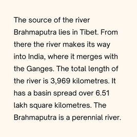
The source of the river Brahmaputra lies in Tibet. From there the river makes its way into India, where it merges with the Ganges. The total length of the river is 3,969 kilometers. It has a basin spread over 6.51 lakh square kilometers. The Brahmaputra is a perennial river.
A second group was given an extracted text. The keywords were in the same position on the page as the simple text, but everything else was removed. Here's an example:
An example of the simple text given to the students

An example of the extracted text given to the students
The third group was given an outline of the text, with the page divided into two columns. It looked like this:
II. Indus
Source
Tibet
Mouth
Arabian Sea
Length
3,610 km
Basin Size
11.2 lakh km2
Flow
Perennial
I. Brahamaputra
Source
Tibet
Mouth
Ganges
Length
3,969 km
Basin Size
6.51 lakh km2
Flow
Perennial
The fourth group was given a matrix, like the one at the top of this post.
The other four groups were also given a simple text, an extracted text, an outline, and a matrix. The only difference was that the keywords were signaled, i.e., they were typed in bold, italicized, or underlined. Here's an example of a simple text with signaling:

An example of simple text with signaling
After the lecture, students studied the display they were given (outline, text, etc.) for 15 minutes. They were told that there would be three tests:
A test on facts. Question example: What is the size of the Brahmaputra basin?
A test to check relationships based on categories. Question example: Which rivers merge with other rivers?
A test to check "global relationships". Question example: What is the connection between perennial rivers and their sources?
The students were tested immediately after the 15-minute period. They were tested again one week later and given the material to study again. Then they were tested one more time in the next phase. All tests in all the phases were the same.
What did the researchers find?
Outlines were found to be better than simple or extracted text, but the matrix was found to be the best.
It helped students to learn facts as well as relationships, while the texts did not.
The researchers also asked students to rate:
how easy they found their display to study
whether they felt they had enough time to study
how well-prepared they felt and
whether they would use the display in the future.
The matrix was rated positively on all counts.
But why are matrices so effective?
The authors gave three reasons:
Signaling
Signaling makes it easy to find a specific piece of information. For example, if you want to know the source of the Godavari or the flow of the Indus, you can find it faster and more easily in a matrix as compared to a simple text.
Extraction
All the different displays conveyed the same information, but the matrix and the outline used fewer words. They kept (extracted) what was most important and left out the rest.
Localisation
Localisation means showing connected items near one another. For example, the matrix above shows the lengths of all the rivers in a single row. In a text, you would find the lengths of the rivers in different locations.
The simple text organized information based on the topic (Indus, Godavari, etc.) but the matrix organized it on the basis of topic and category.
Here's a matrix with information on some common pets (inspired by the wildcat matrix in the study):
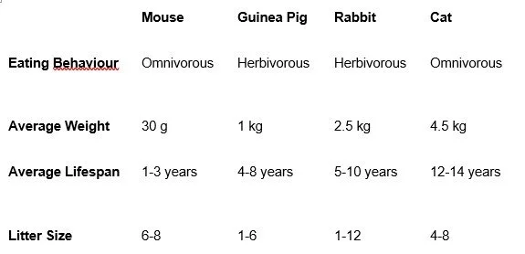
Example of a localized matrix
If you look at the average weight and lifespan, you will notice that heavier animals live longer on average than lighter animals.
A good matrix makes the connections between different concepts like these clear.
The matrix below has the same information as above, but the topics and categories are not organized systematically:
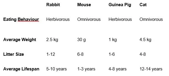
Matrix with topics and categories organized randomly
This makes it difficult to see the relationship between weight and lifespan.
Other types of graphic organizers
You can also organize information in a hierarchy. It will let you see which information belongs on the higher levels and which information should be on the lower levels.
For example, this hierarchy shows the different levels of the nervous system:
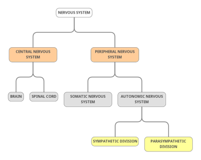
Hierarchical representation of the nervous system
Then there's a sequence:

A sequential representation of Piaget’s stages of cognitive development
And finally, illustrations:

Example of an illustration
How to make effective graphic organizers
The guidelines
In his (free-to-read) paper on graphic organizers (2), Dr Kiewra described how each of these graphic organizer types can be made effective. Here are some main guidelines:
Don't exclude any levels or steps in hierarchies or sequences.
Put connected information closely in matrices--the rows and columns shouldn't be random.
Illustrations should show what is needed. They don't have to look 100% real (see the flowers below).
You can use pictures, but don't include distracting details. Oh, and labels should be near the thing they are labeling. (Click here and here for more examples.)

Label like this.

Not like this.
The tools
You can use Google Docs, Google Slides, MS Word, MS PowerPoint, etc. You can go with Canva if you want to make things fancy and colorful (again, beware seductive details, which can distract students from the important material).
Or you can just draw them on pen and paper and hand out photocopies to your students.
What next?
If you're a teacher, make graphic organizers of the material you teach and use them when introducing a new topic in class. You can later provide the same graphic organizers with missing information for the students to fill in as retrieval practice.
(I've made matrices for taking notes on psychological disorders. Go to this page to download them. )
If you're a student, share this post and Dr Kiewra's paper with your teacher (2). You could construct graphic organizers with your teacher and classmates.
If you're a researcher, especially one based outside the US, consider studying the effectiveness of graphic organizers in your country’s schools and colleges. We need research investigating their effectiveness for students of various ages, subjects, abilities, and backgrounds.
If you're here just to explore and learn, share this post with others who might find this useful.
References
(1) Kauffman, D. F., & Kiewra, K. A. (2010). What makes a matrix so effective? An empirical test of the relative benefits of signaling, extraction, and localization. Instructional Science, 38(6), 679–705. https://doi.org/10.1007/s11251-009-9095-8
(2) Kiewra, K. A. (2012). Using Graphic Organizers to Improve Teaching and Learning. IDEA Paper# 51. IDEA Center, Inc.

